Color Harmony
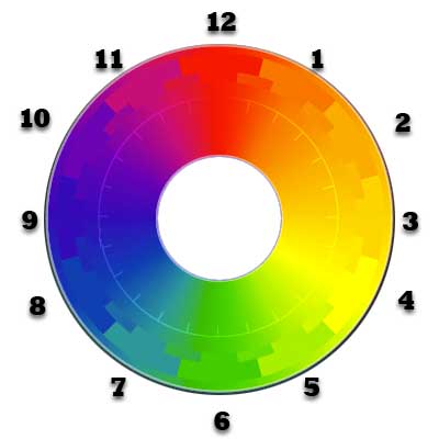
For centuries, designers have sought to define the laws governing colors that work together in harmony.

Readings
- Gabriel-Petit, Color Theory for Digital Displays [uxmatters.com]
(Read the second half, from “Color Properties” to the end of the page.) - Horton and Lynch, WSG 338-39
- Lecture slides: Color Harmony
Workshop
- Download or screenshot a selection from your food bank site that demonstrates its color scheme. (This may include the logo itself, menu bars, etc.)
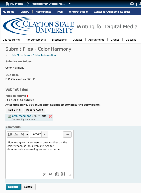
- Open Georgia View and upload the image to the “Color Harmony” assignment drop box (GIF, PNG, or JPG files only).
- In the Comments section of the “Submit Files” window, include a complete, grammatically correct sentence that defines and explains the color scheme.
Workshop Example

Figure 2 includes both the logo and the primary navigation menu from the old version of the ACFB web site. A sentence explaining Figure 2 might read something like:
“Blue and green are close to one another on the color wheel, so this web site header demonstrates an analogous color scheme.”
Figure 3 below shows the Comments section where you should include your sentence.
