Color Models and Color Harmony
Updated: 29 April 2019
 2012-2024 2012-2024
 These slides cover
A color model is a systematic way of defining and re-creating the colors we see in the real world. Over the centuries, designers have developed many different models. In part, these differences are the result of changing technology: the different qualities of paint, printed ink, and pixels require distinct ways of defining and reproducing particular colors.
In the "Color Terminology" sidebar, Horton and Lynch summarize two color models often used in digital media (338-39).
The RGB model comes directly from the ways that pixels work. Each pixel in a screen can glow at different intensities of these three colors. By dialing up or down the intensities of red, green, and blue—blending these three colors in different ratios—a single pixel can be made to glow in any one of millions of distinct colors.
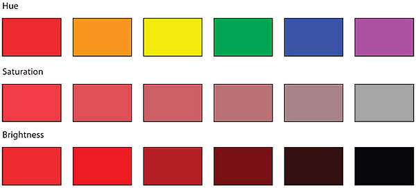
The HSB model is a little more complicated, but it is frequently used by designers to talk about color.
Color Harmony simply means a group of colors that together produce a pleasing effect.
A "harmonious color scheme" depends on the balance all three properties (hue, saturation, and brightness) of each chosen color. About a dozen different approaches to color harmony are commonly used today. The Web Style Guide includes a summary image including four of these approaches on the bottom of page 339.
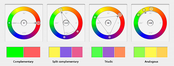
For our class, you will need to know the four in our textbook, plus one more:
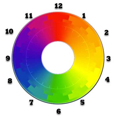
The color wheel on this slide is the one we will use in class and that you will see on exams.
Like individual colors, particular combinations of colors communicate different emotions.
Complementary color schemes, for example, often feel energized and dynamic. For this reason, sports teams often choose complementary colors like orange and blue or purple and yellow (or gold).
Analogous color schemes, in contrast, often feel more calm, static, and understated.